Responsiveness: Checks and Challenges
Performance Hindrances on Your Mobile sites and it's Challenges.
NO ONE LOVES BULKY APPLICATIONS
Research and surveys have shown that users reject applications those are difficult to use and access to the mobile devices. Thus, components those are cumbersome won't survive in the market. Getting optimized for desktops, no longer ensures a competitive edge.
Last year when Joomla went responsive with its flagship release of Joomla 3. It was time for PayPlans to get a whole new overhauling.
Earlier: PayPlans dashboard compatible with Joomla 3 but completely unresponsive at 320px.
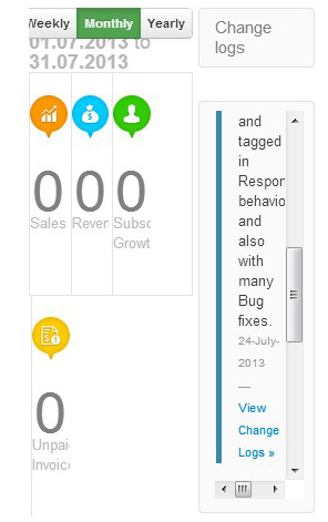
Earlier: PayPlans dashboard compatible with Joomla 3 but completely unresponsive at 320px
Well, while pursuing the dream of creating a Responsive design. Team PayPlans pondered over various factors and held meetings discussing the final design. Many were rejected, few were selected.
Now: PayPlans' responsive dashboard compatible to Joomla 3 at 320px.

Now: PayPlans' responsive dashboard compatible to Joomla 3 at 320px.
But over here, "I wish to share with you the basic key factors that we tried keeping in consideration while switching to a responsive design and I believe that these key factors will also serve individuals designing websites too."
Basic Factors to keep in mind
-
Make it simple to use buddy - The end user should be able to easily input his details for logging in or newsletter subscription or any thing. If not done with proper care and research it will hamper the input speed and also increases chances of errors. In addition, data entry by the user in different positions (while walking, sitting or holding a device) may further worsen the problem of data entry.
What I feel is letting the computer perform as many tasks as possible, so that users can concentrate on performing tasks that actually require human processing and input. For example, calculating body mass indexes, remembering user IDs, and mortgage payments are best performed by computers.
-
Keep a check at Screen Resolution compatibility - The display capabilities of mobile devices are less than what we normally have on desktops (Normally the display is 640*480 pixels or below). Low resolution hampers the multimedia content presented on the screen of mobile device. A different device and display resolution of mobile devices results in different usability results.
-
Remember mobiles are not desktops - Mobile devices have undergone drastic changes in the last few years. The high end mobiles tend to mimic the Desktop PCs held in hands, but they are not. General mobile devices still lack the computational power and memory storage in comparison to desktops. So, the Applications or the websites developed for some PDA may not be useful for the general mobile devices and this gap should not be a very large one, else you would be limited to a fixed user group.
-
Connectivity - We are very much depended for our day to day activity on our handheld devices. And the power of the mobile devices to provide information anytime and on any topic depends solely on its internet connections which is sort of unreliable and affects the smooth functioning of mobile applications. In addition, the connection strength and data transfer speed vary based on time and location. Therefore, giving rise to the connectivity as a challenge.
The solution to this is one should try minimizing the time required to download a Web site's pages. The best way to facilitate fast page loading is to minimize the number of bytes per page.
-
Inform users of long download time - It is the least that you can do to console your mobile users to an extend. As I mentioned above mobile surfing totally depends on its network speeds and indicating to users the time required to download an image, document or application at a given connection speed will greatly relieve them.
Giving users sufficient information to choose whether or not they are willing to wait for the file to download will enhance their trust in your brand. One study also concluded that supplying users with download times relative to various connection speeds even improved their web site navigation performance.
-
Horizontal Scrolling is a death trap - While designing one must use an appropriate page layout to eliminate the need for users to scroll horizontally. Horizontal scrolling is a dull and irksome way to view an entire web page on a small screen. Common page layouts including fluid and left-justification and may require some users to scroll horizontally if their monitor resolution or size is smaller than that used by designers.
These were some of the issues that we could trace out while switching over to the responsive design. Well, I believe this is not an end to the issues, as technology advances there will be mobility combined with touch as well as voice control system further allotting new complexity.
But, I believe having a responsive site helps in the internet marketing and SEO practices too. As Instead of having to develop and manage content for multiple websites, businesses with responsive sites can take a unified approach to content management because they have only one responsive site to manage.
Also please share your troubles with all of us; that you faced while experimenting with website responsiveness. It will provide a useful insight for everyone.
Thank You.

Shyam Verma
Full Stack Developer & Founder
Shyam Verma is a seasoned full stack developer and the founder of Ready Bytes Software Labs. With over 13 years of experience in software development, he specializes in building scalable web applications using modern technologies like React, Next.js, Node.js, and cloud platforms. His passion for technology extends beyond coding—he's committed to sharing knowledge through blog posts, mentoring junior developers, and contributing to open-source projects.