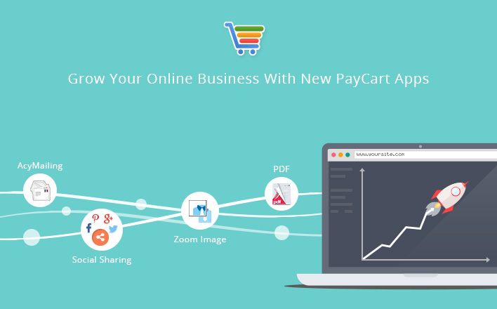
How Good Checkout Can Skyrocket Your Sales.
Find out why your store's checkout page is killing conversions.
We at Ready Bytes, performed a complete analysis on checkout process and found out what works best. We incorporated our findings in PayCart to offer the most effective checkout process.
So, here are the secrets of making a winning checkout process.
Guest Checkout
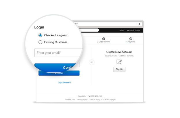
Customers dislike having to register for purchasing something, this is why PayCart comes with guest checkout option which is a powerful feature in todayâs online stores.
- Speedup to increase conversion - Ask minimum, Get Maximum. That's true, if there are less barriers and distractions for customers, you will most likely increase your conversion rate.
- No forced registration - Increasing customer base is always good factor but not at the cost of losing potential sales.
- Easy form filling - People hate filling up forms, so it should be kept to a minimum which makes it painless to end customers.
Ajaxified Checkout Process
Paycartâs checkout process is completely ajaxified so user don't need to navigate from one web form to another. Data submitted is retained in session which helps if user want to edit information by going to previous step during checkout process.
- If payment fails then you don't need to start from scratch, everything will be placed as before and you just simply pay again.
- If any error occurs then it will show at same place.
Ajaxified checkout process reduces page load time and improves page speed which especially helps in online shopping on mobile devices.

Clear Error Indications
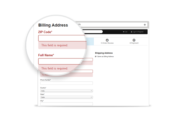
PayCart shows proper and clear error indications to users which helps them identify and correct the error quickly. We scroll the screen at the place where error has occurred So, no matter which device your customers are using for online shopping, they can quickly find the error. A guiding error message will help them find the cause of error and resolve it with ease.
Enclosed Checkout Process
Removing distractions is one of the best ways to reduce cart abandonment rate. This process focuses shoppers on completing the payment by stripping away unwanted information from the default site.
How Paycartâs enclosed checkout increases conversion rate?
It provides focused Information to shoppers like where they are within the checkout process and how many steps they have left to complete their purchase. PayCart encourages a one way movement towards checkout completion.
We are also planning to remove unnecessary distractions like menu and navigations. With the main navigation removed, the checkout process will be even more focused to encourage purchase to customers.
Linear Checkout Process
âLinear checkout process attains higher conversion rateâ.
We make the checkout process completely linear to provide easy mental model for customers. PayCart never lead the customer back to a previously shown checkout step. Including the cart step.

Mobile Friendly and Screen Responsive
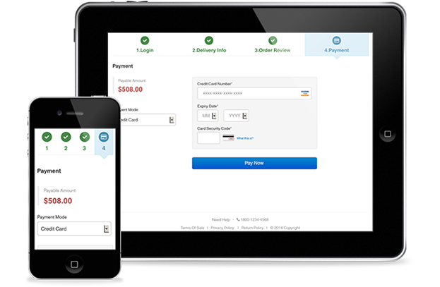
Normally Checkout process is not so easy on mobile devices as input fields or labels are not properly placed but PayCart checkout process is fully mobile friendly. Also, the forms adapt themselves based on various screen sizes and make it fully responsive.
Progress Indicators
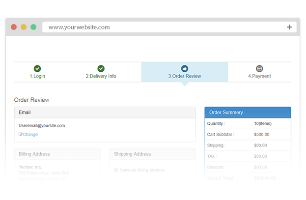
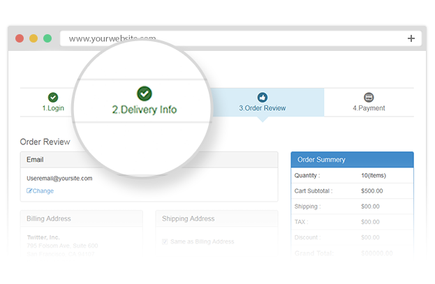
The customers can easily know where they are in the checkout process and what else needs to be done to complete the purchase. PayCart provides a progress bar at the top of each checkout step which will show a visual indicator of the linear checkout process.
Minimum use of Contextual Words Like âContinueâ or âApplyâ
In all action buttons of PayCart, we have used such words which encourage user to take action rather than making them confused. All the âCall to Actionsâ words are created by experiencing user's state of mind or which direct proper action e.g. Place Order, Proceed to Payment, etc.
Utilize Shipping Address As Billing Address By Default
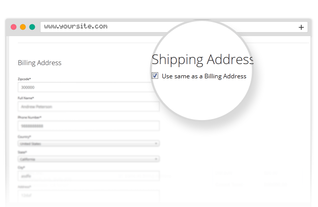
Mostly customersâ billing address and shipping address are same, so by default PayCart uses shipping address same as billing address which will reduce many fields, and risk of misspelling error in address and the most important thing, it expedites the checkout process. Instead, if you have different address than PayCart lets you enter them separately.
Flexibility to Modify Cart During Checkout
PayCart empowers customers to modify cart even when they are on checkout page. They can modify the quantity of a selected product or remove few selected products from the cart.
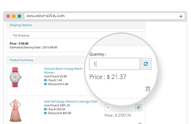
Product Summary for Purchase Review
Let customers review the details they have entered before proceeding to order. Remind users of the important contents of the product they are going to order which includes name, quantity, size, color, tax.
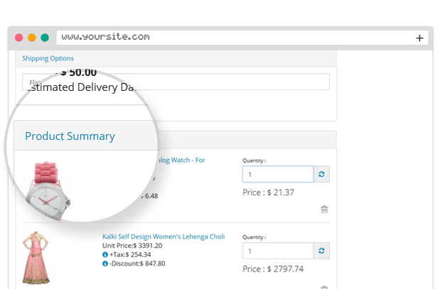
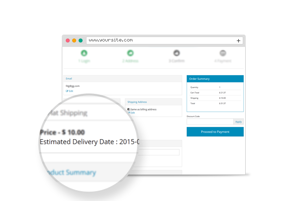
Includes an Approximate Shipping Date
The time has gone when people had to wait a long for their package. Now the quality of shipping has attained a higher standard. In exchange of user's zip code and their shipping method selected, PayCart admin can decide an approximate shipping date when user expect to receive it.
With the latest improvements in Web technology and browsers, the potential to create an amazing user experience has increased dramatically. We have designed an improved checkout process with our experience and in upcoming time it is going to be even more stunning. We believe that customerâs shopping experience will be enhanced manifold using PayCart and this will play a key role to increase conversion rate for customers using desktop or handheld devices.
If you have any such idea to make checkout process more smooth and hassle-free then please share your comments below!

Shyam Verma
Full Stack Developer & Founder
Shyam Verma is a seasoned full stack developer and the founder of Ready Bytes Software Labs. With over 13 years of experience in software development, he specializes in building scalable web applications using modern technologies like React, Next.js, Node.js, and cloud platforms. His passion for technology extends beyond coding—he's committed to sharing knowledge through blog posts, mentoring junior developers, and contributing to open-source projects.
